-
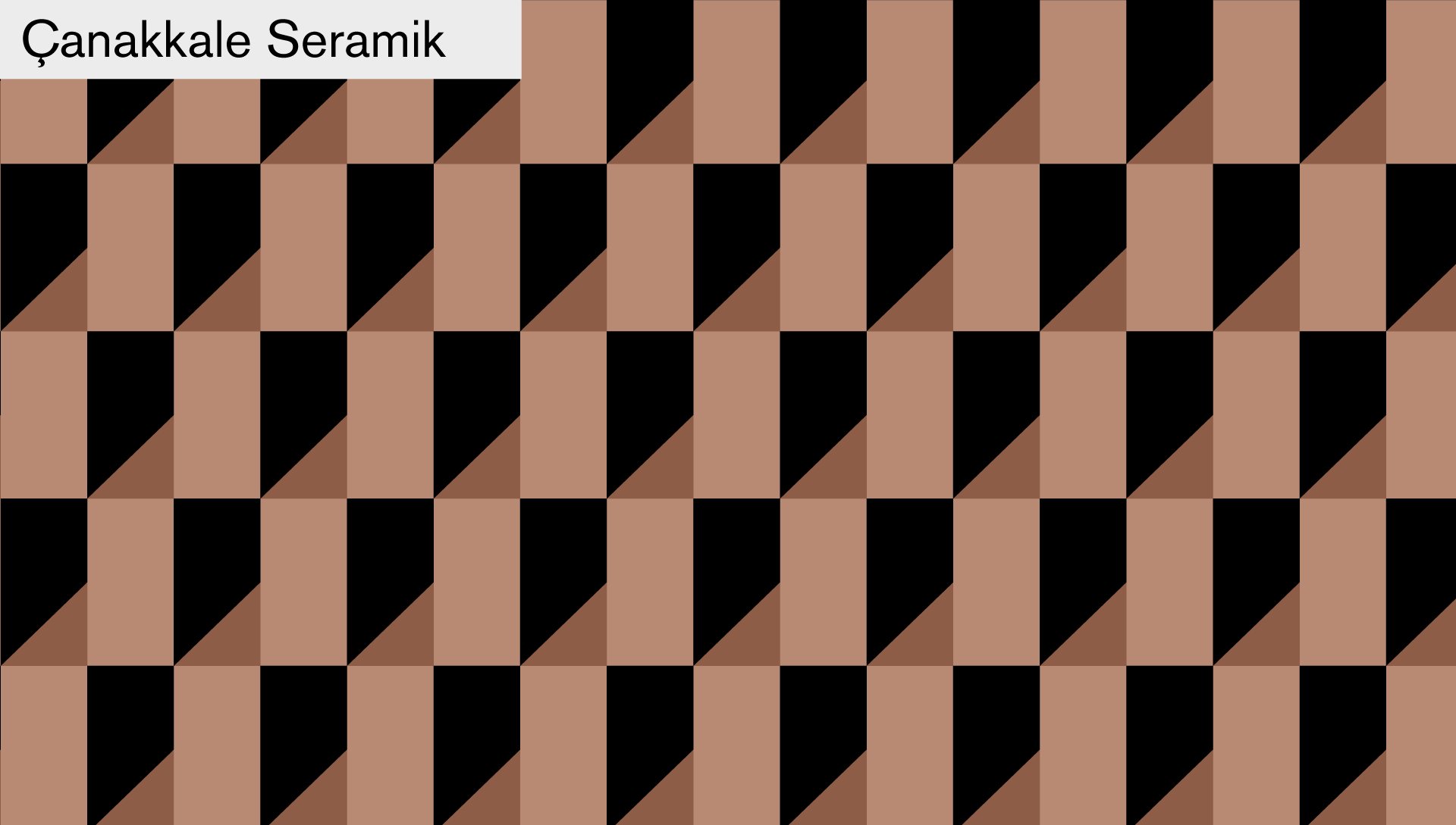
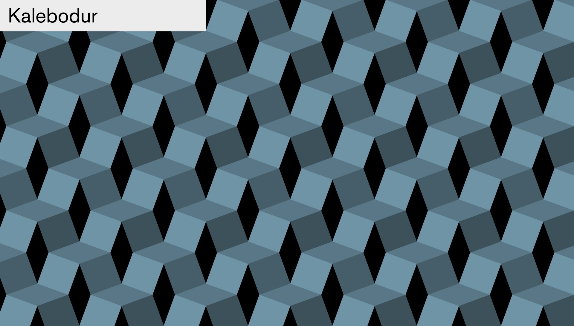
Our design for Kale’s new stand at Cersaie 17 pushes the company at the forefront of a new trend: a mutable and fluid ceramics market made of smaller numbers, higher quality and wider offer. It’s a simple, light design – almost a pop-up temporary showroom – along with a very iconic visual communication.
We used versatility as a conceptual frame. A low-definition modular design complemented with an external semi-transparent digital printed fabric skin. The modular elements are easily reusable giving shape to ever new display spaces and the fabric skin is a communicating surface providing always new messages and identity. Adopting semi-transparent walls to display solid ceramic surfaces was a challenge. A radical choice indeed, a real switch of mind. We found a solution designing self standing displays organized in a continuous landscape of vertical and horizontal ceramic surfaces, thus making the product collections the central focus of the exhibition.
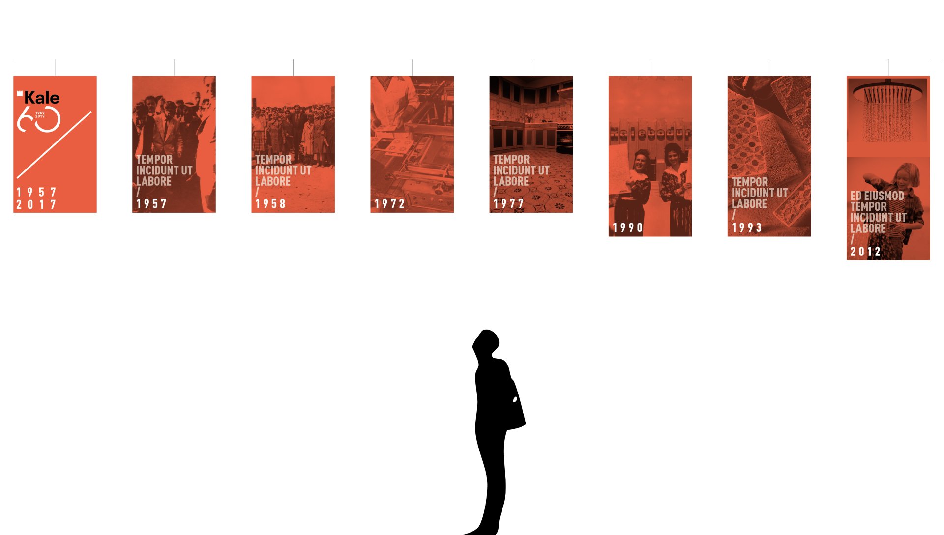
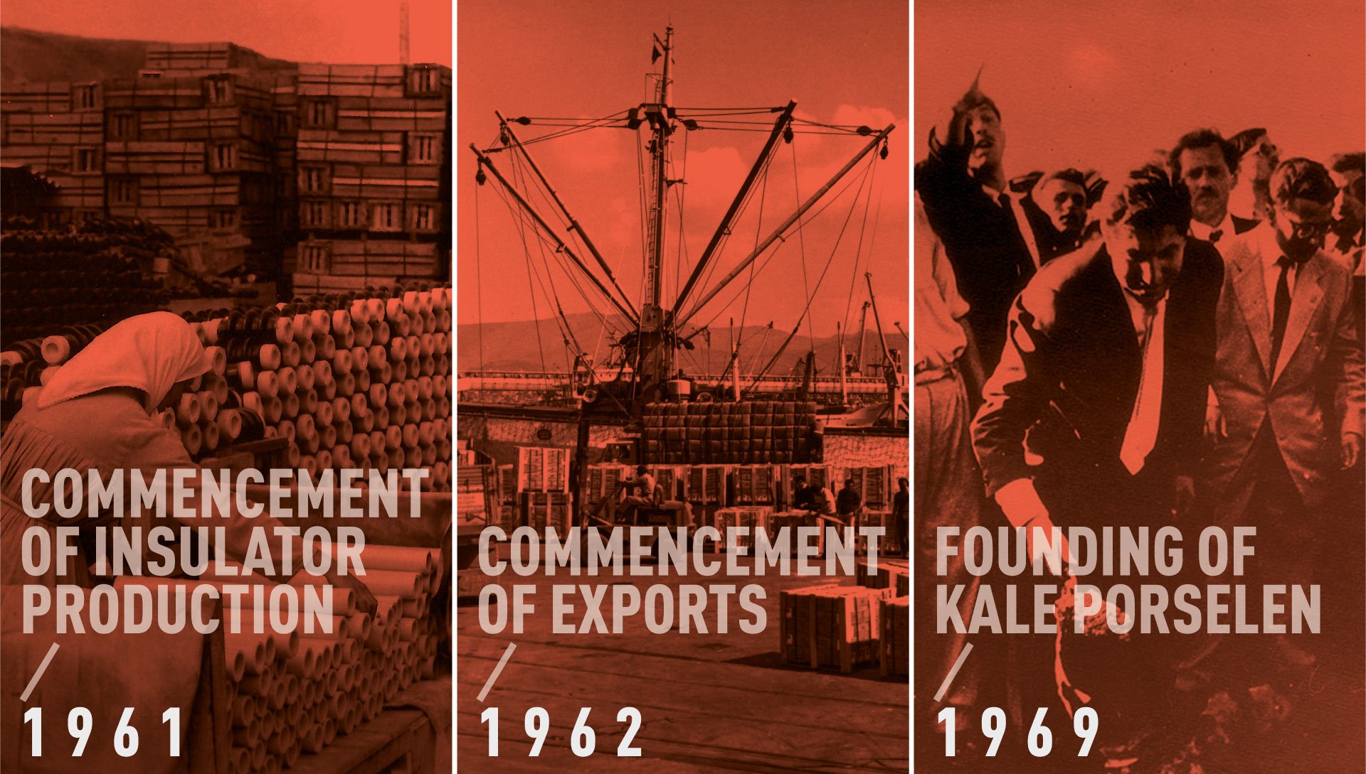
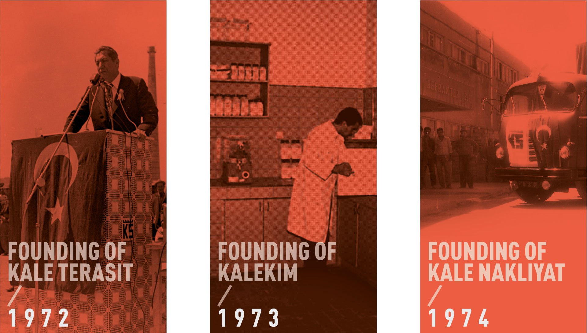
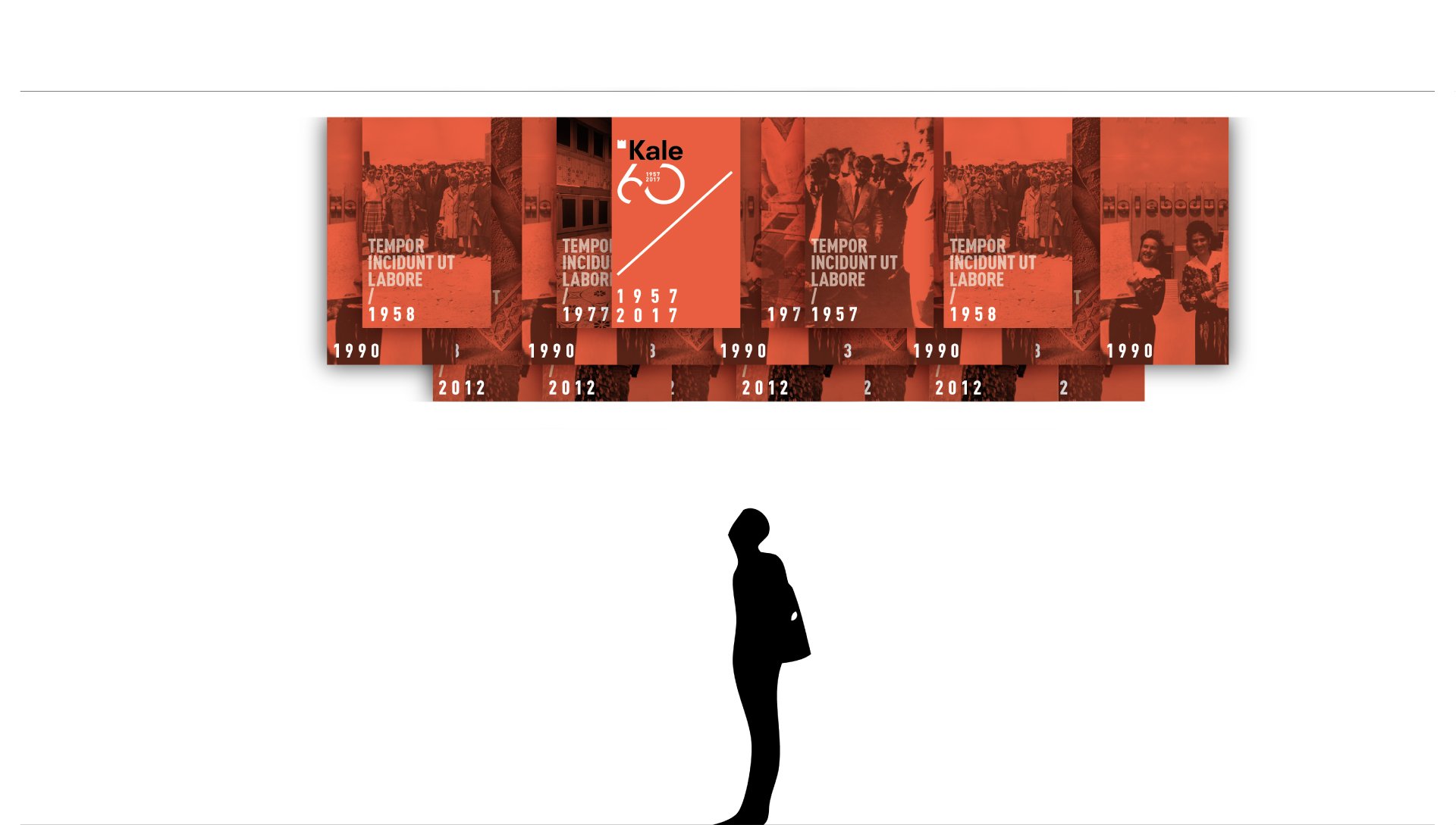
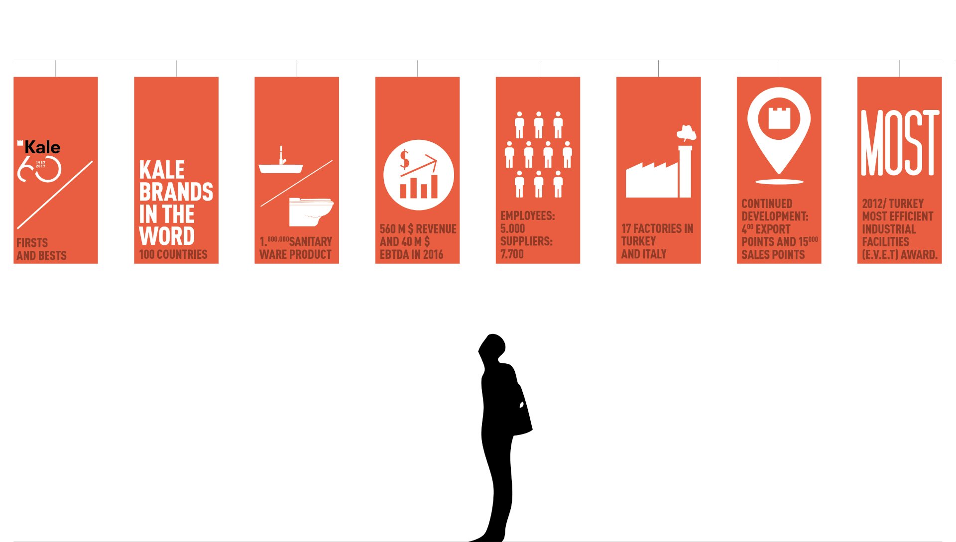
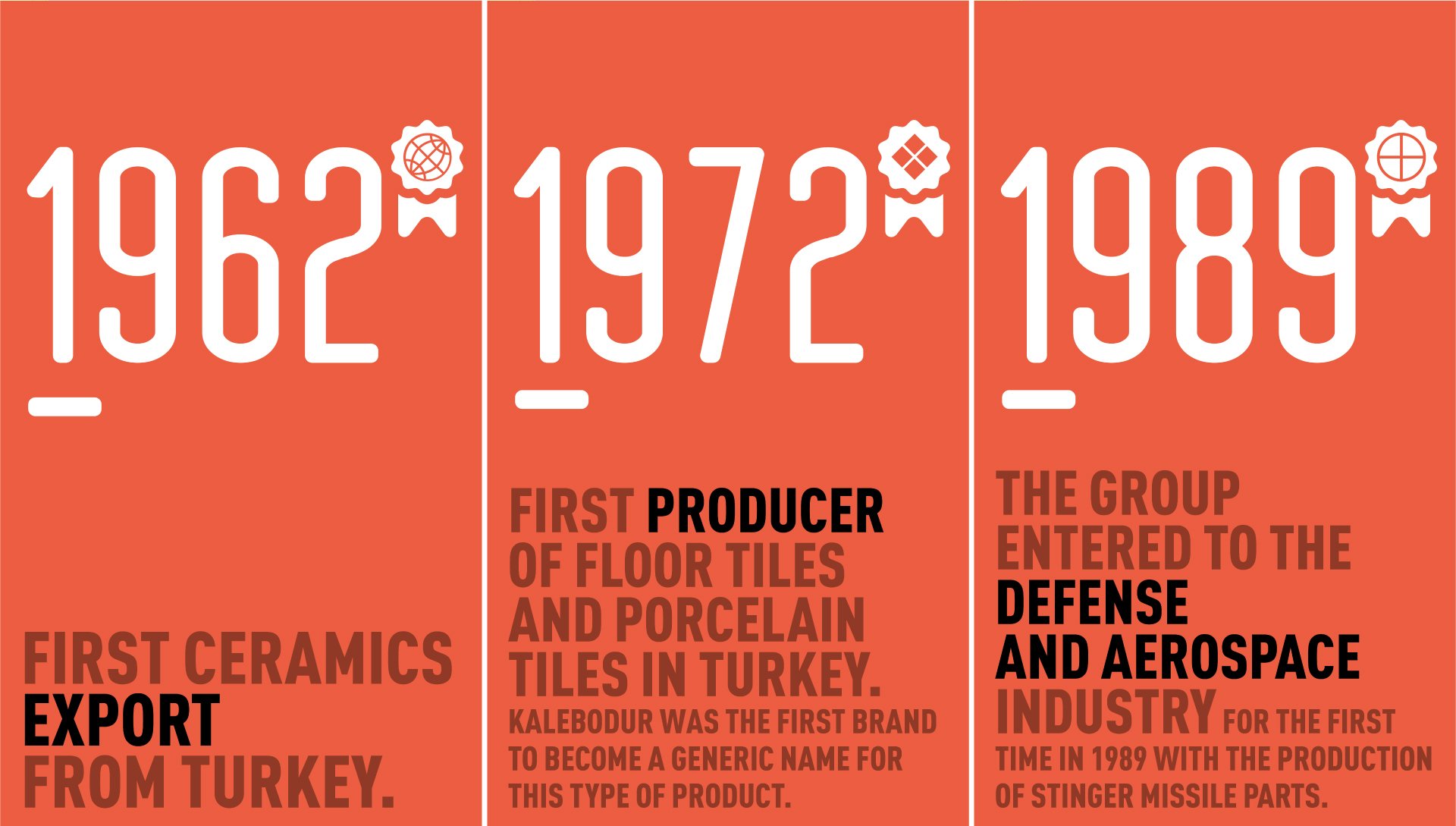
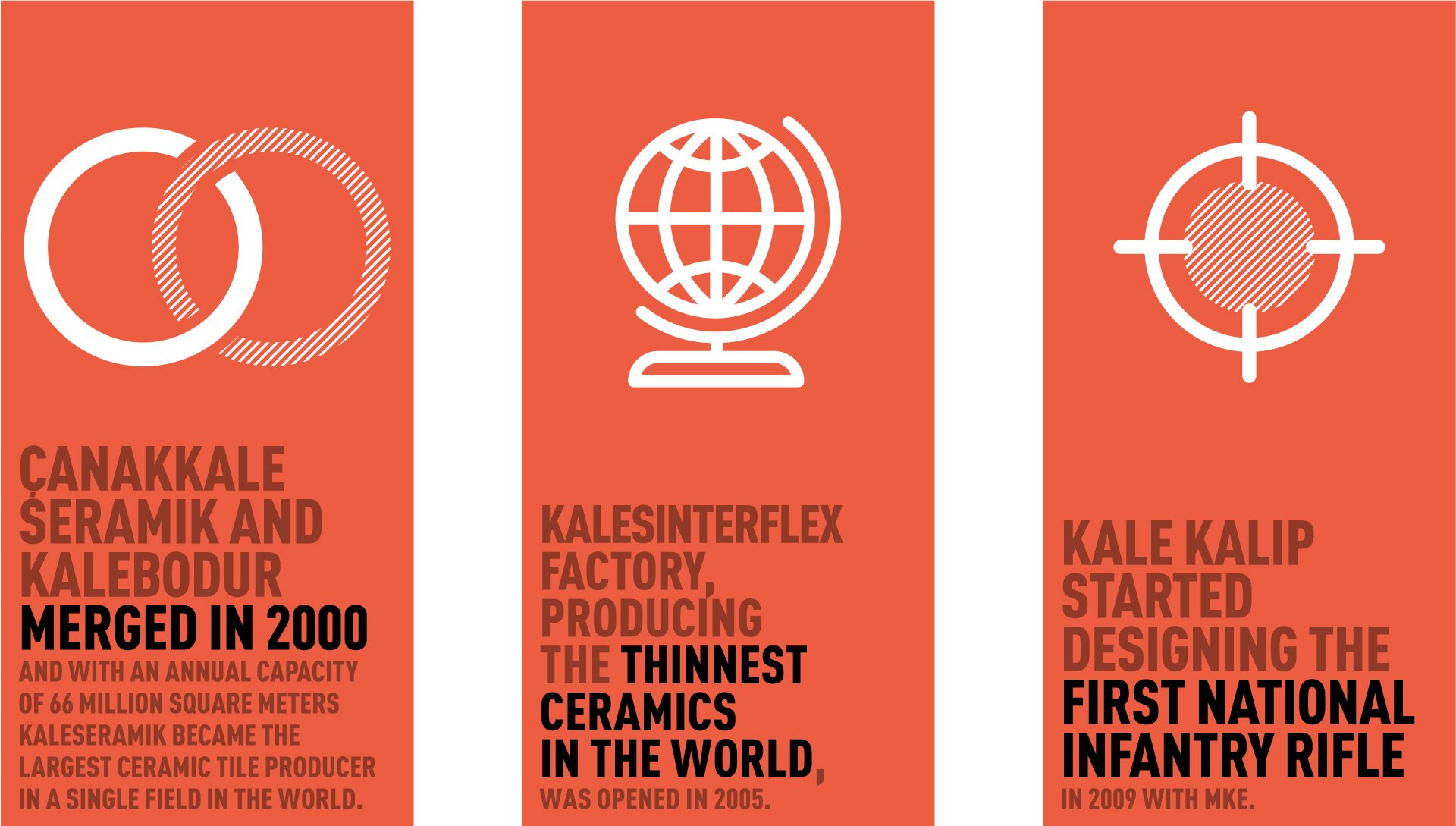
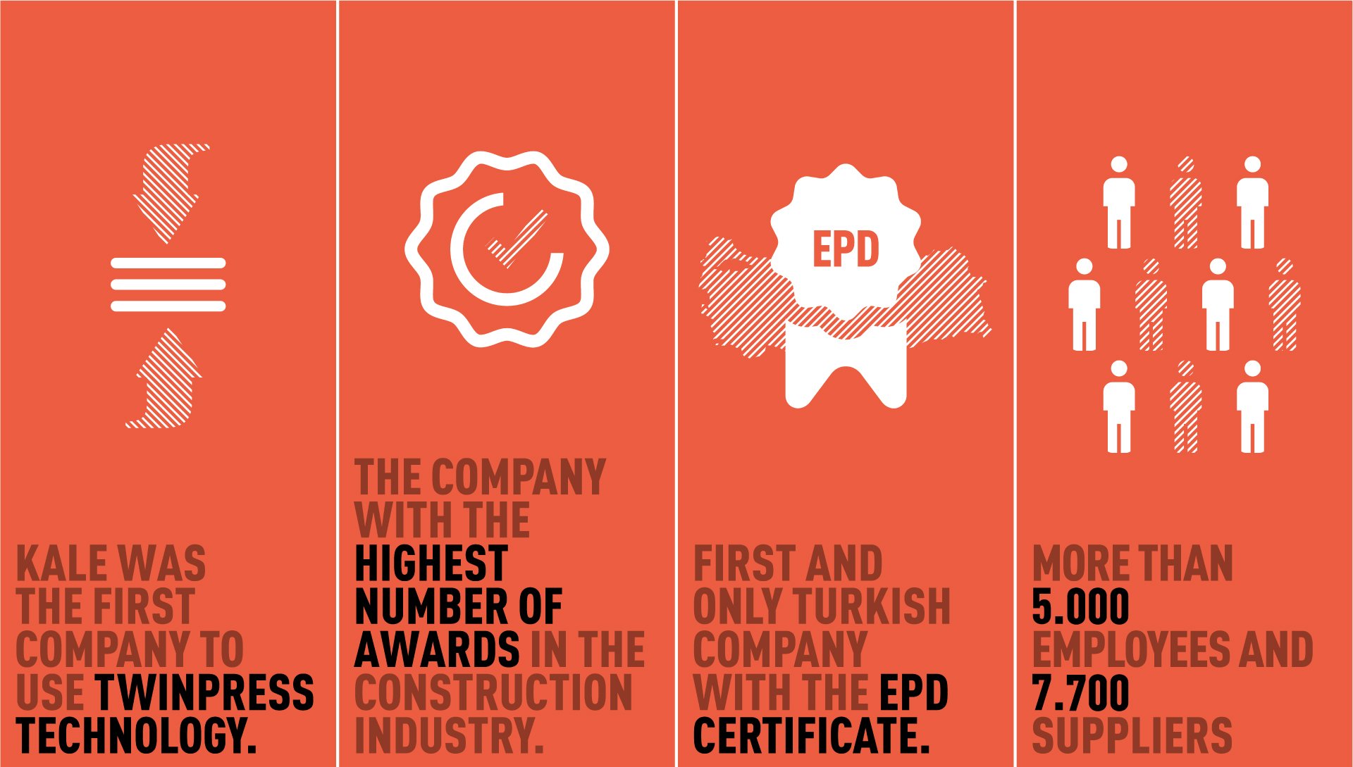
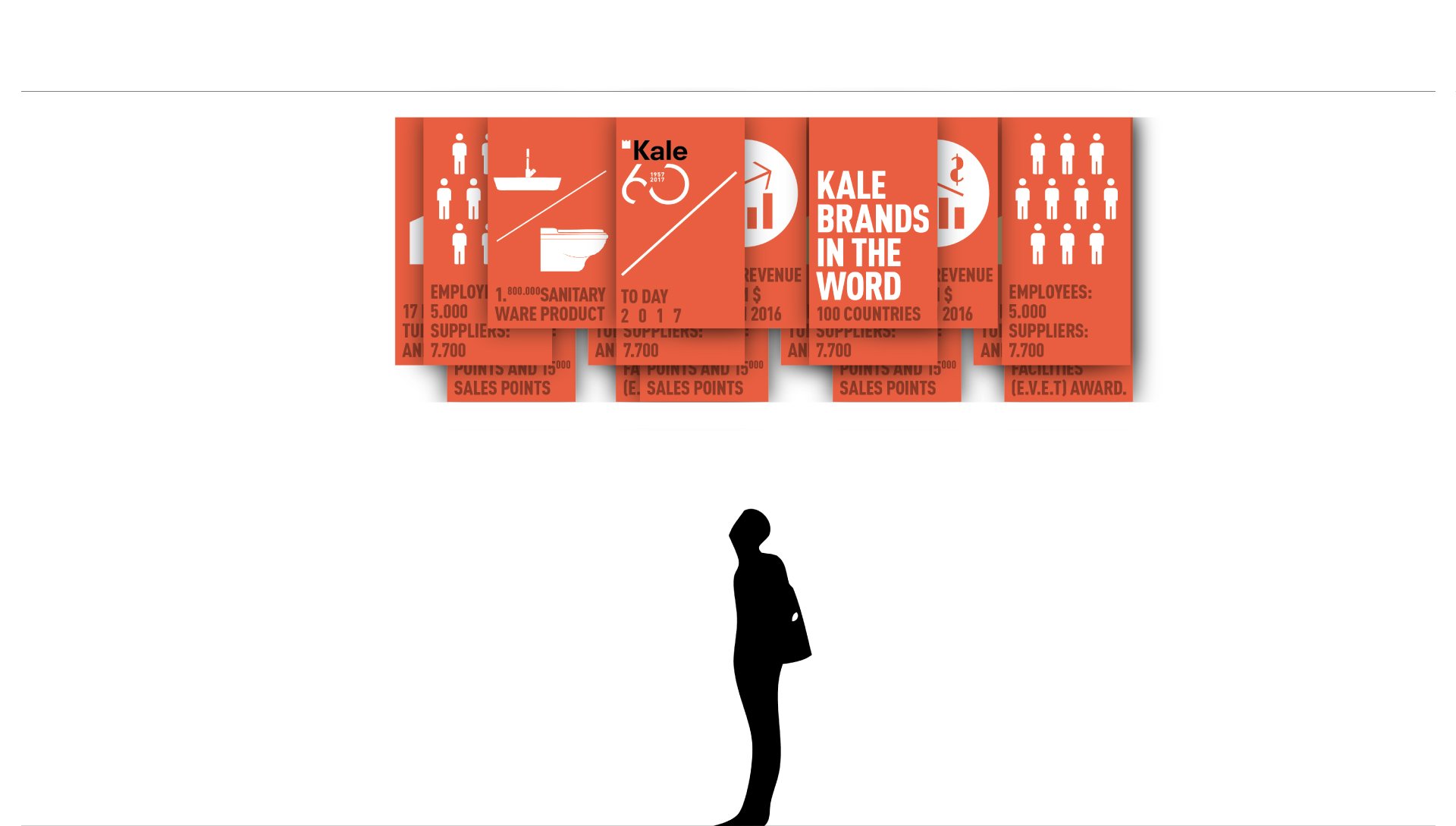
Celebrating the 60th anniversary of Kale Group, orange red banners hanging from the ceiling underline the Company’s timeline and highlights, gifting at the same time the welcoming lounge areas with a festive feel.–
FRAME Award 2018_nominee
[+]
–
Client/
Kale GroupTrade show/
Cersaie 2017, Bologna ITCreative direction/
Paolo CesarettiDesign team/
Paolo Cesaretti, Paola Danesi, W/ Noel PrekaVisual design/
Claudia AstaritaContractor/
La BottegaArea/
700 SqmPhoto/
Lorenzo Pennati, Denis MolinariPostproduction/
Lorenzo Pennati

