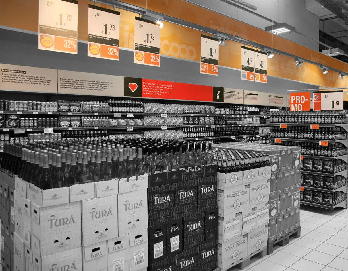
When we met the client - the most prominent mass retailing brand in Italy - he was starting to reorganize the commercial format of its hypermarket chain. At the same time it was evident the need to adjust its identity to a new philosophy implying simplification / reduction / systematization of information. The situation was chaotic, characterized by the inconsistent and free application of an old communication format in each of the outlets.
So - inspired by functional urban aesthetic and in need for delivering clear and consistent messages - the project provides a spatial mesh organized in fixed areas and levels designed for communicating. This amplifies the understanding from the customers of the rich body of information and simplifies the updates made by the store staff. The ethic of saving, underlying the cooperative philosophy, is here transposed using the minimum amount of signs, operating a continuous formal subtraction. A chromatic identification between the brand and the concept of “affordability” is a further element of characterization of the intervention, which strengthen the brand perception and defines the image of the stores.