-
Designing a massive bathroom furniture exhibition in a small space requires some confidence with the stage and a feel for the expectations of the audience. The designer finds himself in the uncomfortable position of directing a play with so many big characters within a limited plot. So some coup de theatre is necessary.
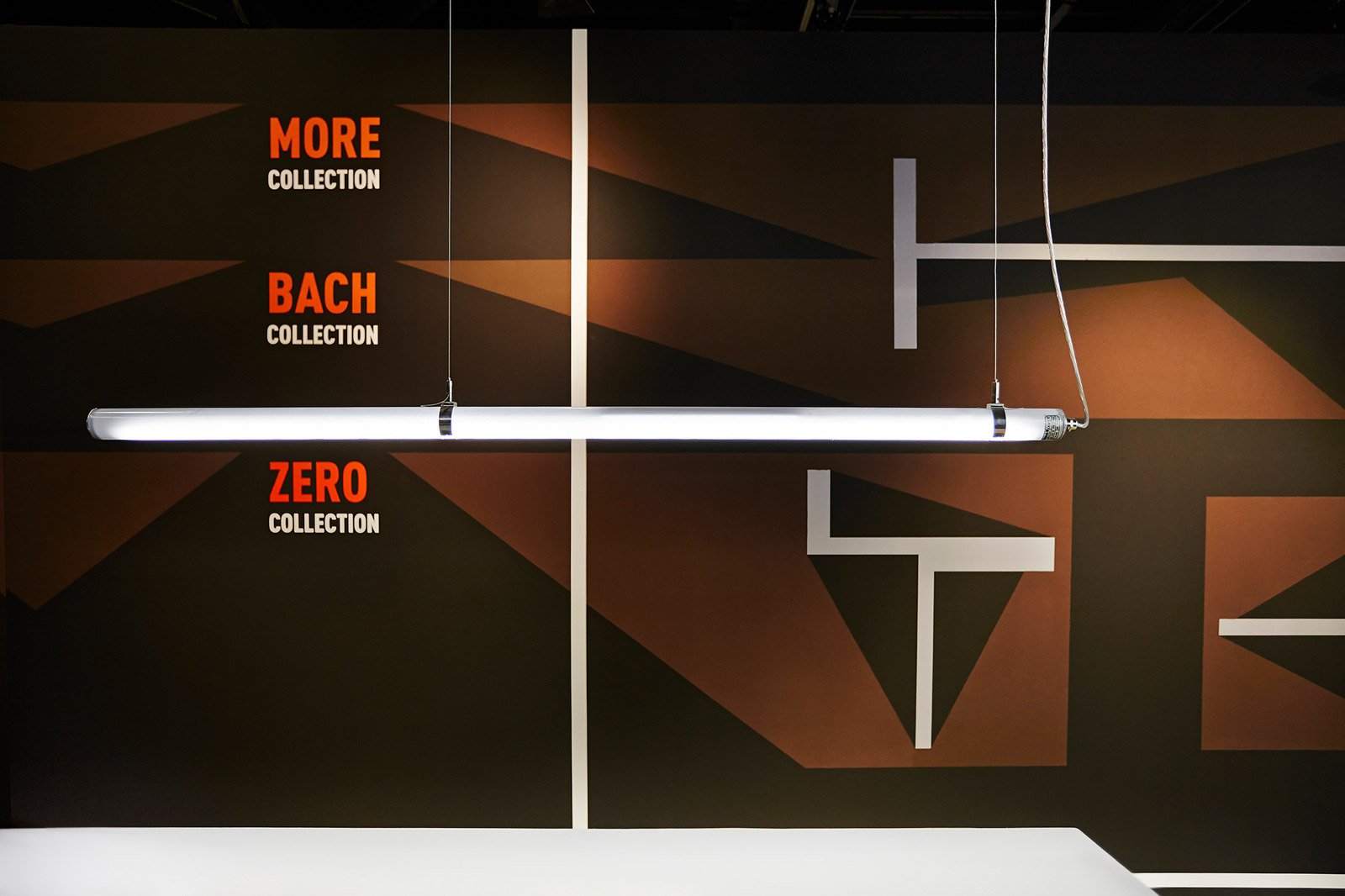
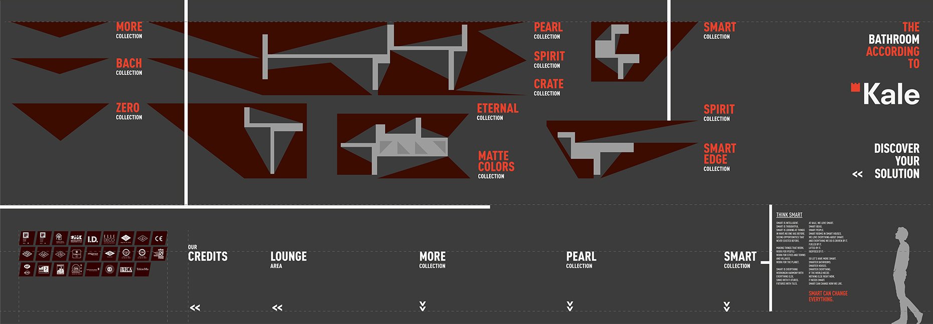
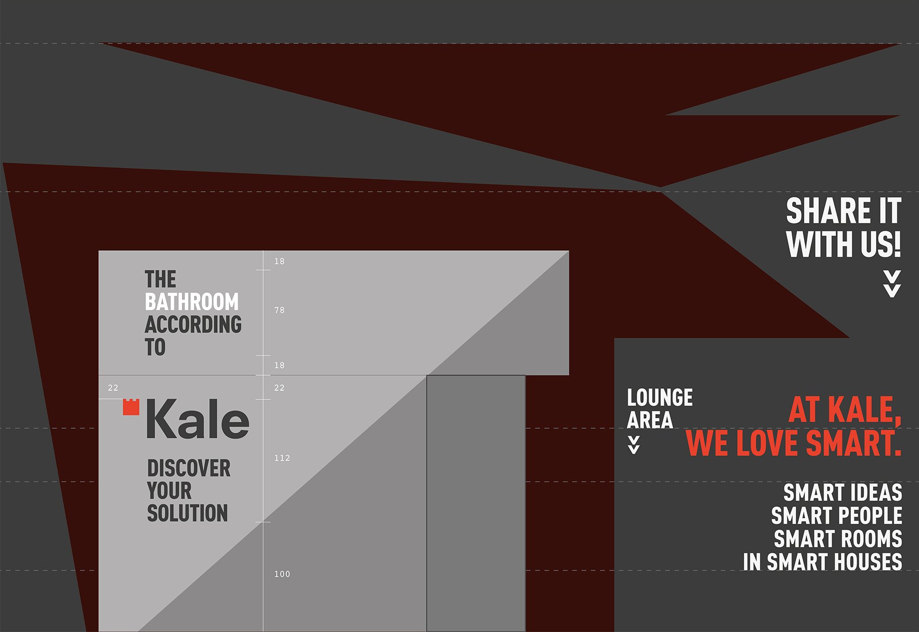
For instance the solution is a palette of smooth colors that wraps solid jagged geometries staging different families of products. Contrasting with the deep all-black background these fragmented geometries lead the visitors through a simple and fluid path. Additionally the abstract graphic treatment of the wide back walls results to be the floor map of the displays, helping the visitors to orientate.
As in a floor-to-ceiling acrobatic jump the play of geometries have a last leap onto a tridimensional composition of neon light tubes floating all over the stand space. Like in any theatre worth of respect a higher balcony gifts the guests with a bird-eye view of the whole installation.
–
Client/
Kale GroupTrade show/
Ish 2015, Frankfurt DCreative direction/
Paolo CesarettiDesign team/
Paolo Cesaretti, Debora Palmieri, Manuela Mottareale, Rami BoushdidVisual design/
Claudia AstaritaContractor/
La BottegaArea/
153 SqmPhoto/
Alexandra Rep


